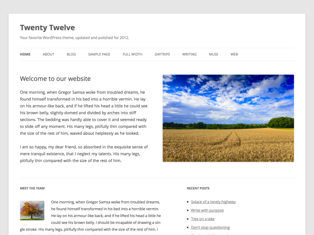
Every year, WordPress comes out with a new theme to serve as the default theme for its growing population of bloggers. For this year, the WordPress team has come up with the Twenty Twelve, which numerous users have described as being infinitely readable and, best of all, remarkably responsive – a welcomed quality considering how Internet users today rely on a wide variety of sites to manage their blogs .
From Blogs to CMS
Today, more and more users are turning to WordPress not for blogging but to provide them a free and easy-to-use CMS or content management system. With CMS sites, the main purpose is to have a simpler way of organizing content. Certainly, the new Twenty Twelve layout was designed to make WordPress more CMS-friendly. The homepage provides a great way to introduce readers to what the site is all about, with the upper portion providing all the necessary facts that a reader must know. These can include text, photos, music, and videos. The lower portion may then consist of widgets you have personally selected for your site. If you wish, some of these may also appear on the homepage alone.
Responsive Design
It’s one of the latest buzzwords in the Internet, and the creative team behind WordPress makes sure that Twenty Twelve does not disappoint in terms of what today’s growing number of mobile users are looking for. When it comes to responsive web designs, the point is to make your WordPress blog compatible with all types of browsers and platforms.
In this aspect, Twenty Twelve is guaranteed to work fully on tablets, smartphones, and of course the usual lineup of computers and laptops. It has also been designed to match the requirements of today’s newest upgrades for retina displays and Hi-DPI screens.
If you are not sure your customized layout will work fine even on mobile screens, then you can make do – even temporarily – with the Twenty Twelve for now. Whether on screens small or big, your site will load quickly, correctly, and beautifully.
Fonts
A new and visually appealing Open Sans font accompanies Twenty Twelve. It’s definitely a refreshing change compared to the usual fonts you were provided with previous default layouts. It’s clean and modern – the kind that would appeal to Internet users who above all things do not want to waste their precious time on blogs that don’t have anything worthwhile or sensible to offer.
Header Image Support
Unlike with previous versions such as Twenty Eleven and even Twenty Ten, the newest default theme from WordPress does not provide you with pre-selected images for your header. In fact, this part of your blog will not even be visible until you switch it on and choose your own photo to upload.
Twenty Twelve is the collaborative result from various members of the WordPress community although its design is primarily credited to Drew Strojny. To select this as your default theme, you can access it by going to your dashboard and clicking on Appearance and Themes. It will be bundled up with other services and features for the upcoming 3.5 version of WordPress.
